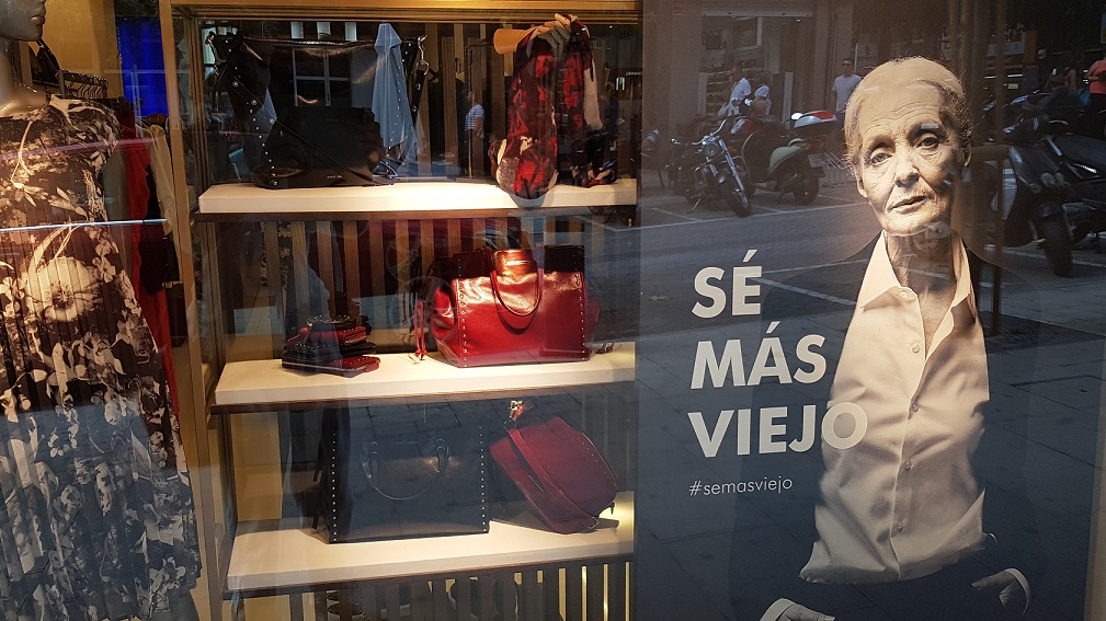
Adolfo Dominguez uses an older model as its new poster girl
If you've been in Spain at all recently, you may have seen this ad in store fronts for fashion designer Adolfo Dominguez.

?S? M?s Viejo? (?Be More Old?) is the written message alongside a black and white image of a female model, hands deep in her elegant pockets, lines deep in her elegant face.
?I love it, I really love it,? says a mature woman checking out
the new season?s offerings in the shop window. ?It acknowledges that we?re not
all young and perfect for ever, we?re just not.?
?The lines on a woman?s face tell her life,? says her younger friend.
?That is a real se?ora, a beautiful se?ora with a whole lot of presence.?
?It does get your attention because it reflects reality in a way the usual fashion ads don't," points out a man in his fifties.
What do you think of the ad? You can vote and comment anonymously here.
Despite all the talk of inclusivity and diversity, fashion still seems reluctant to follow the trend - more people are living longer!
Adolfo Dominguez broke the mould in 1984 with the slogan, ?La Arruga es
Bella? (?Wrinkles are Beautiful?), which was intended to underscore the natural
beauty of clothing, wrinkles and all, as a second skin. In the same year, the
company designed the outfits for the popular U.S. detective show Miami
Vice.
The ?Be More Old? campaign is, in part, a defence of durability against the
tides of fast fashion. It illustrates the wisdom and value associated with longevity
and careful choices.
?The poster shows that fashion is for everyone,? says a woman in her twenties. ?I like that.?
It shouldn't even be worth talking about, should it?

Posted by Giovane Tomaz Costa on 15/10/2019
Keywords:
